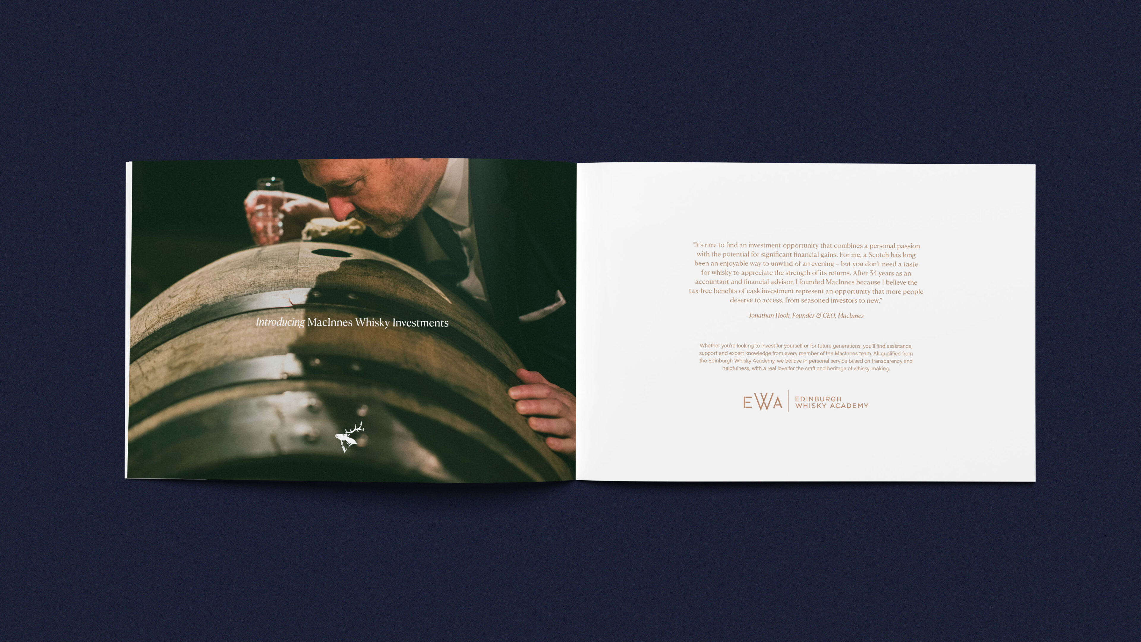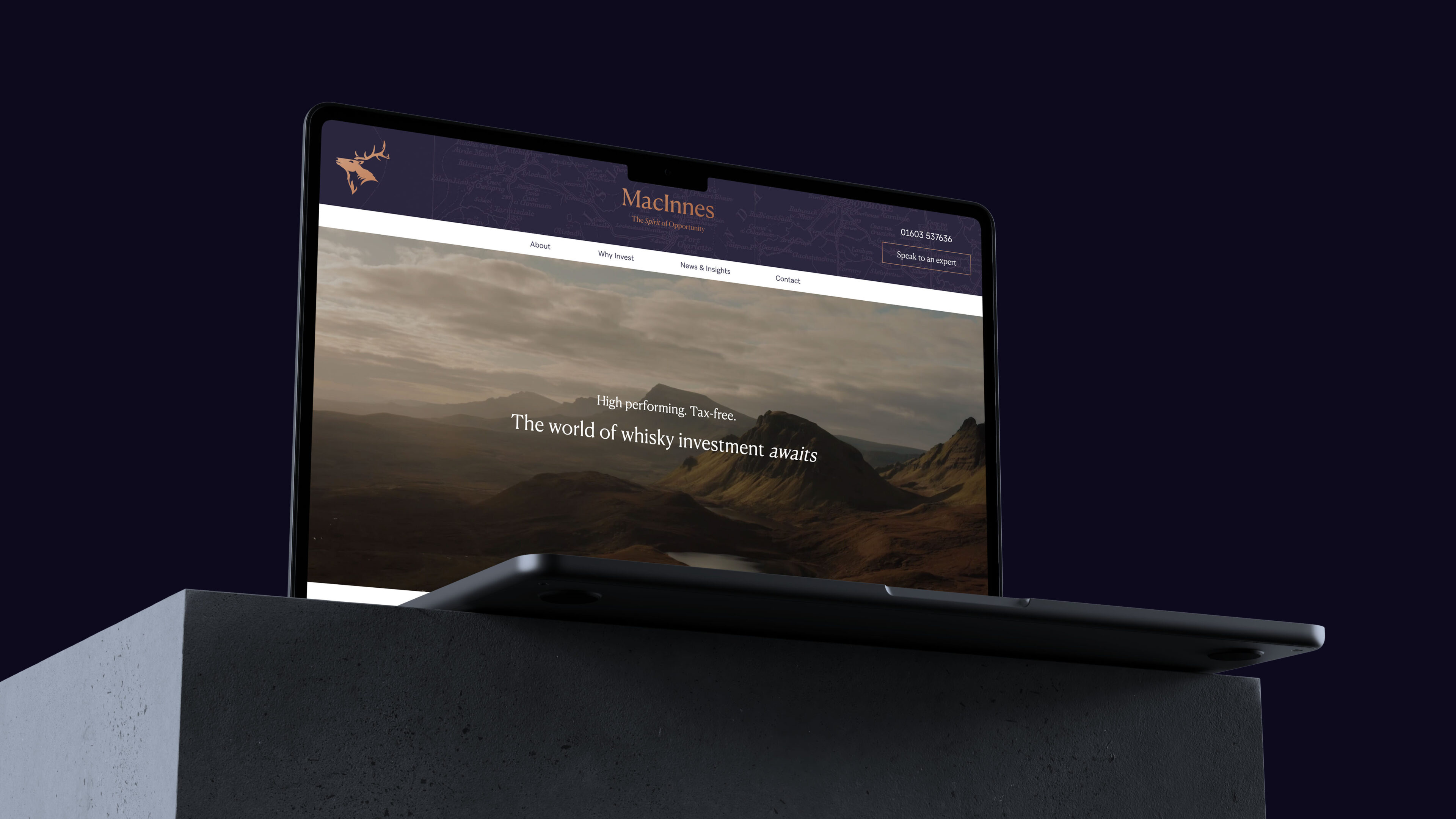
MacInnes Whisky offers an accessible gateway into the world of whisky cask investment. Nestled in the picturesque landscapes of Islay, Jura, and the River Spey, MacInnes finds its heart in the age-old alchemy of oak casks.
We were tasked to come up with a brand for the company, combining a unique mix of traditional and modern design techniques, blending minimal design with impressive luxury finishes.
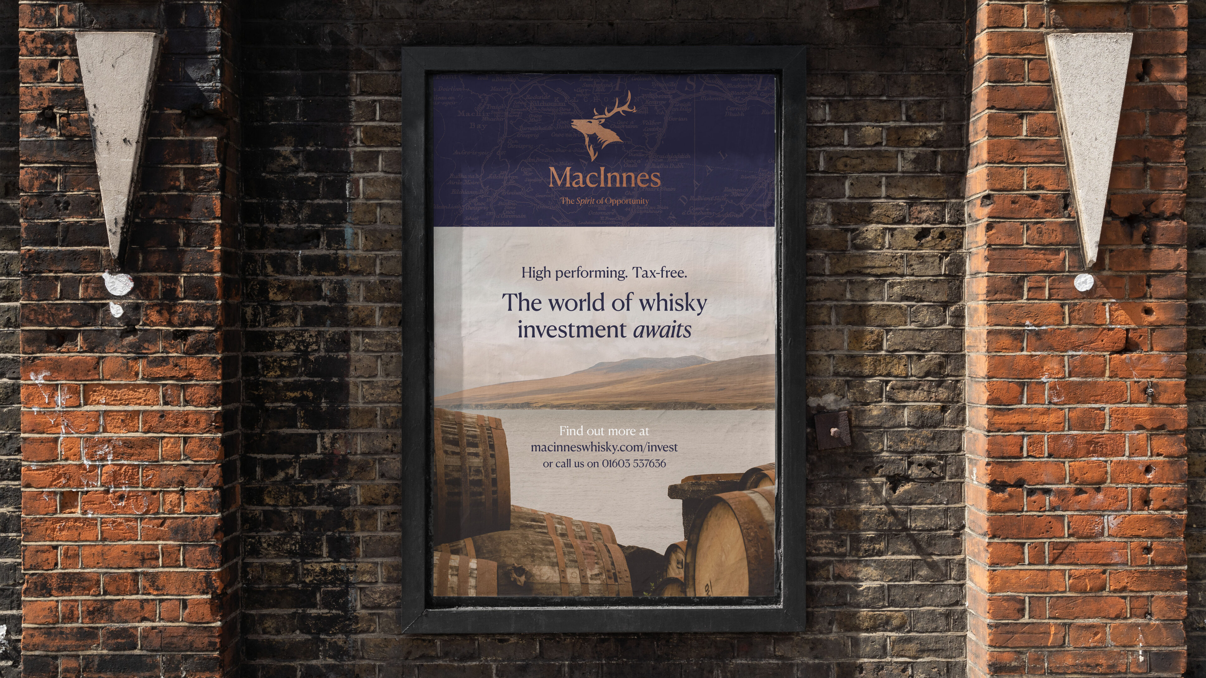
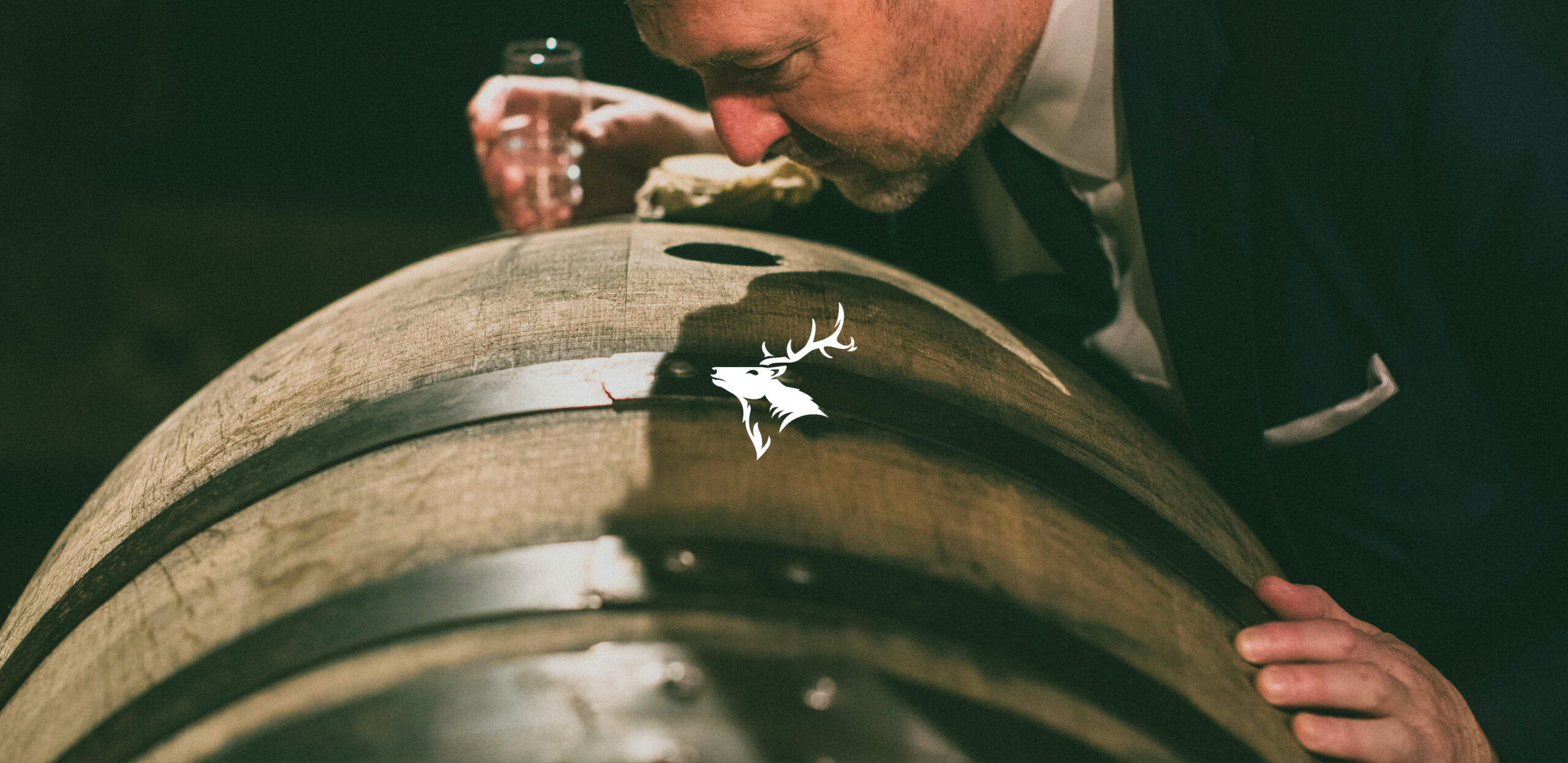
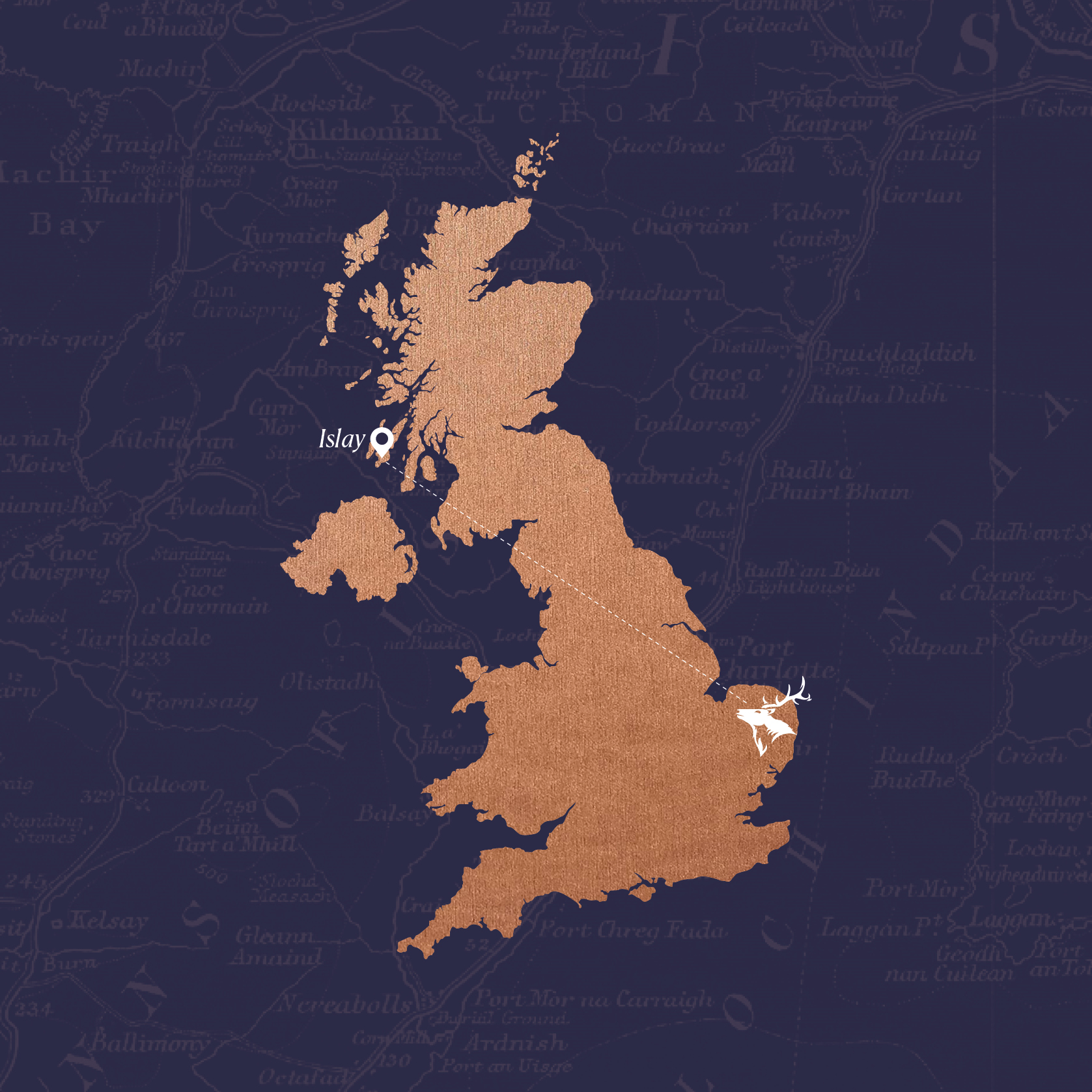
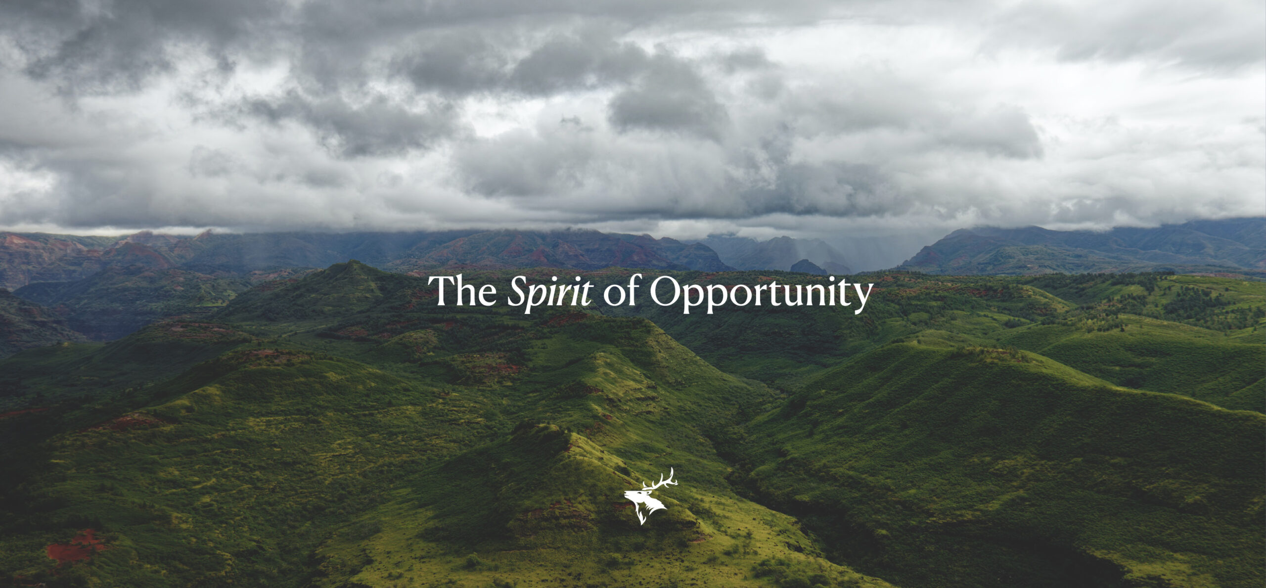
The MacInnes stag looks to the northwest – home to Islay, Scotland, and the incredible, sweeping landscapes that inspired the brand. Using maps of Islay and photography of its unforgettable rolling hills and greenery, we’ve engrained a sense of place into MacInnes, despite the brand’s home now being a fair distance from where it all began.
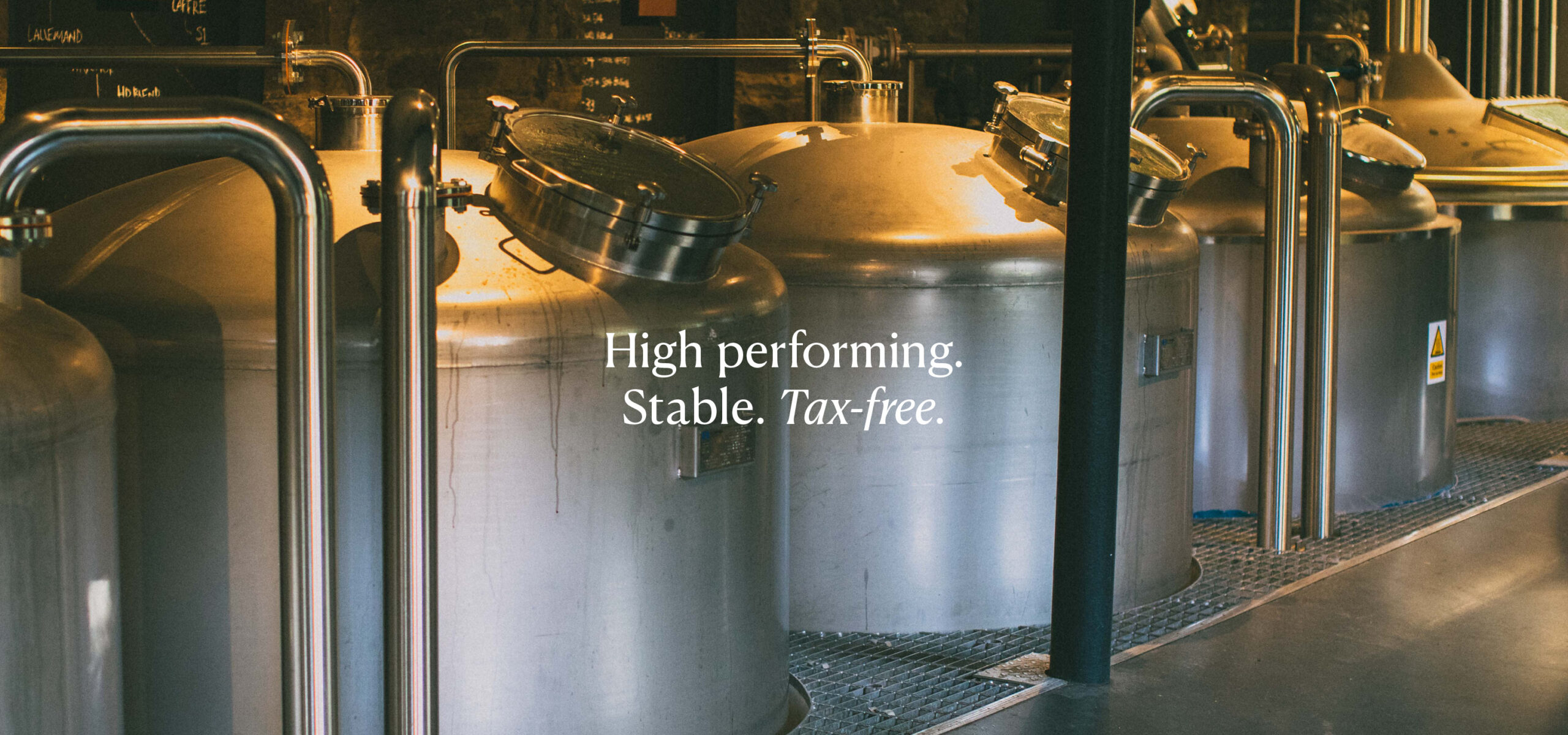
The typeface for MacInnes is a blend of serif and sans-serif – a perfect midpoint of the two, striking a balance between new and old, modern and traditional.
We oversaw the rollout of brand assets from their Whisky Investment Guide to their banners, billboards, internal documents and website.