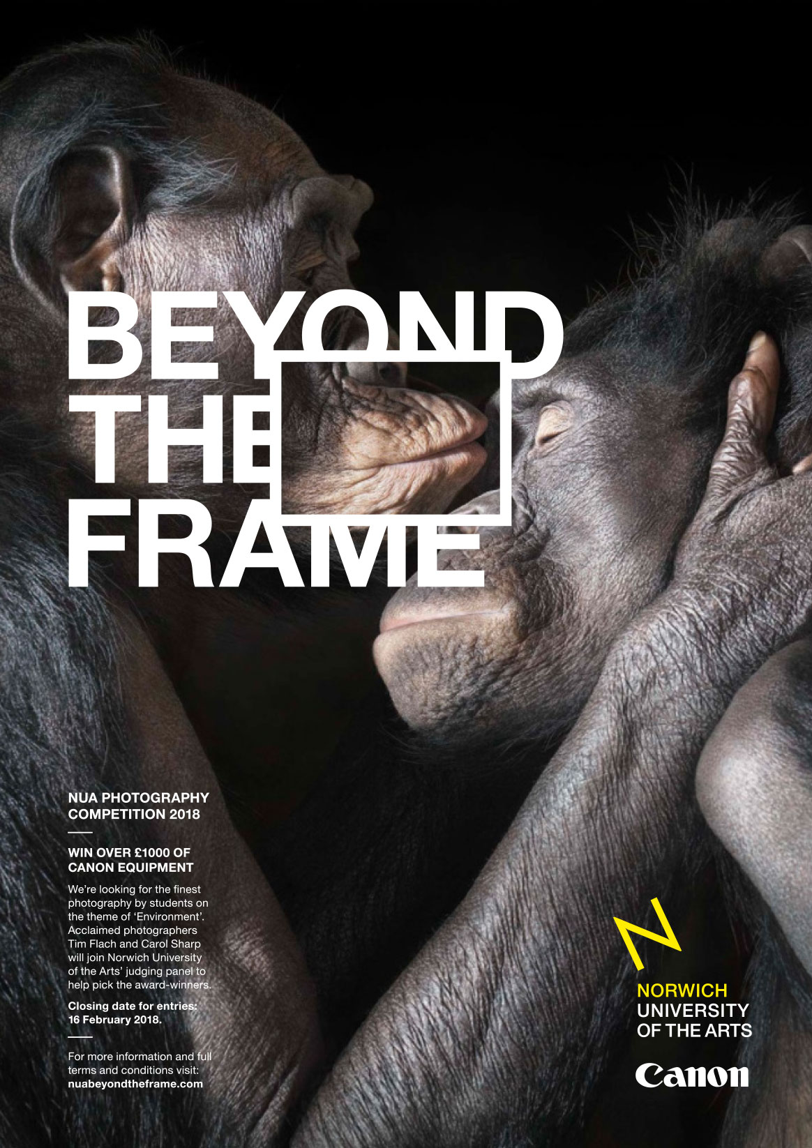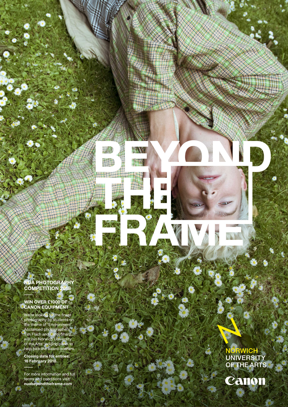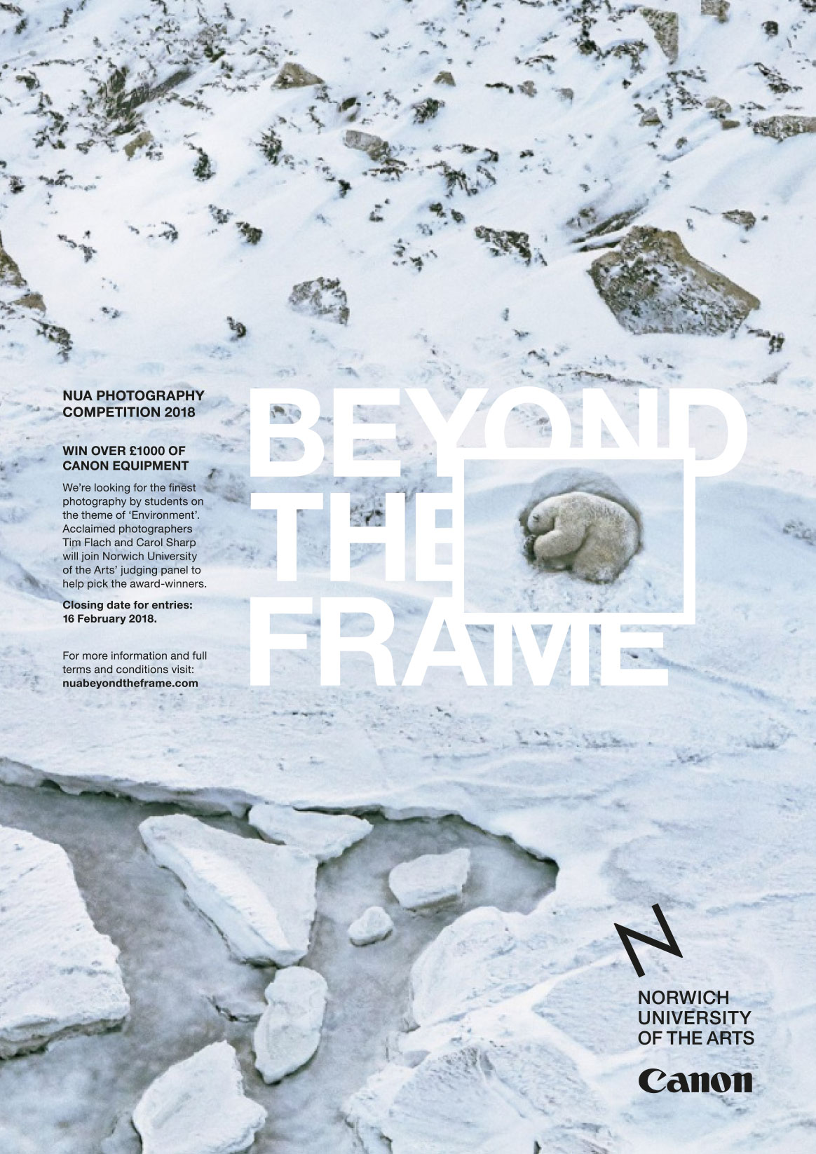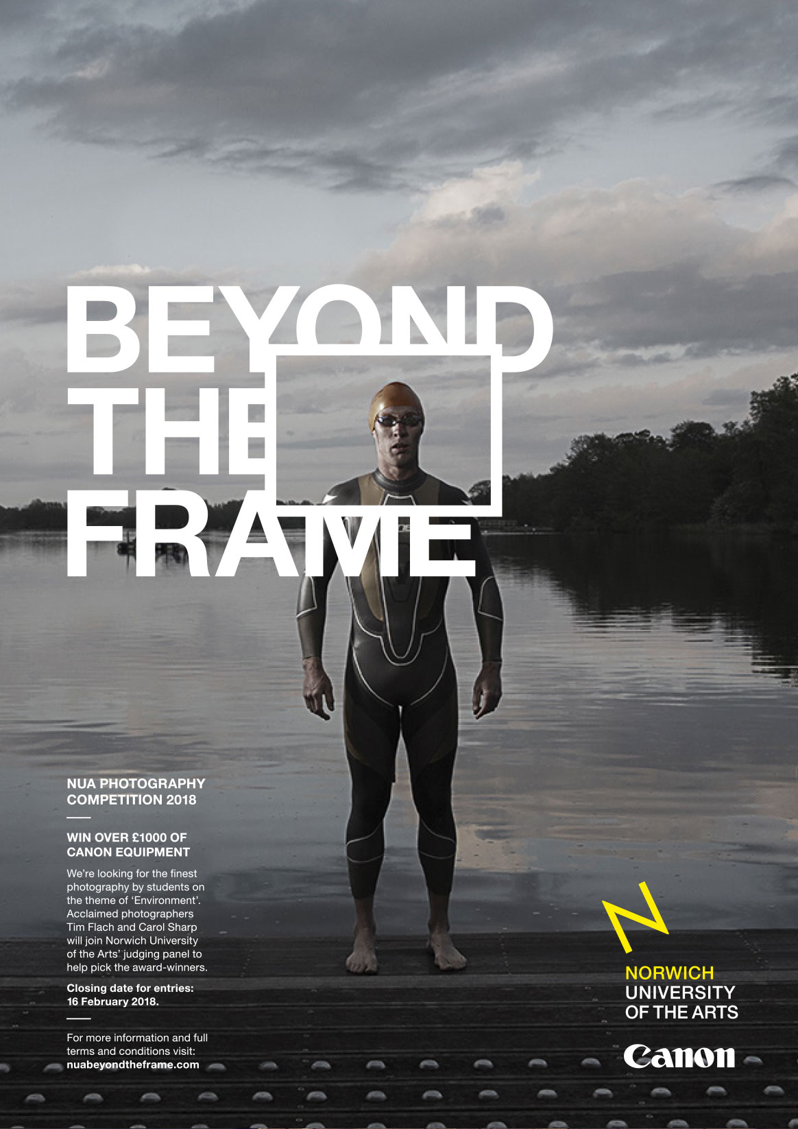
Norwich University of the Arts’ Beyond the Frame competition is a yearly, open invitation to young photographers across the UK to enter their best images in response to a theme. It’s judged by industry-leading photographers, in collaboration with Canon, with the best entrants taking home top-of-the-range Canon camera equipment.
We were asked to create a stand-out brand identity and accompanying campaign to promote the competition and attract new audiences, reflecting the creativity of the entrants and spirit of the competition.
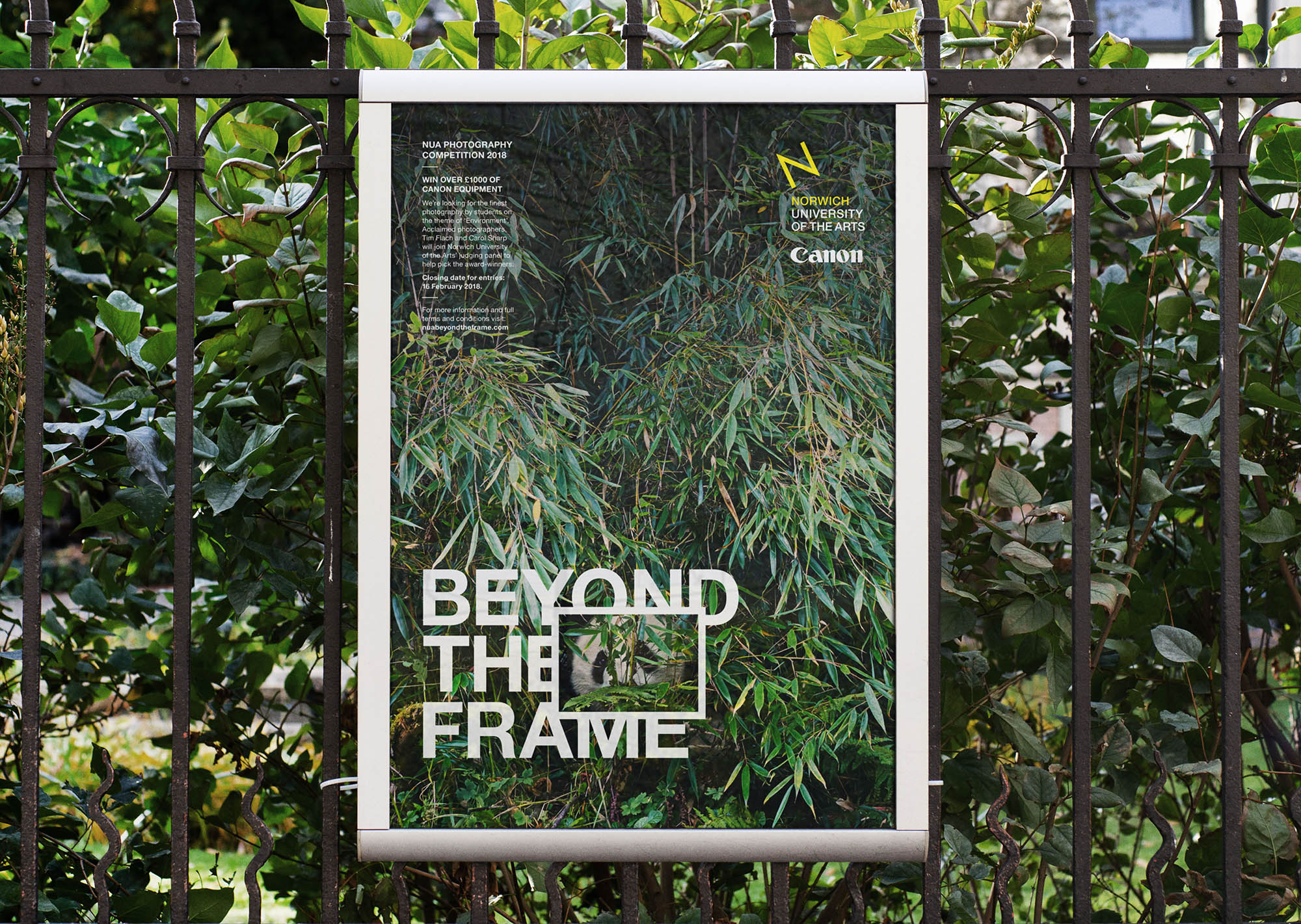
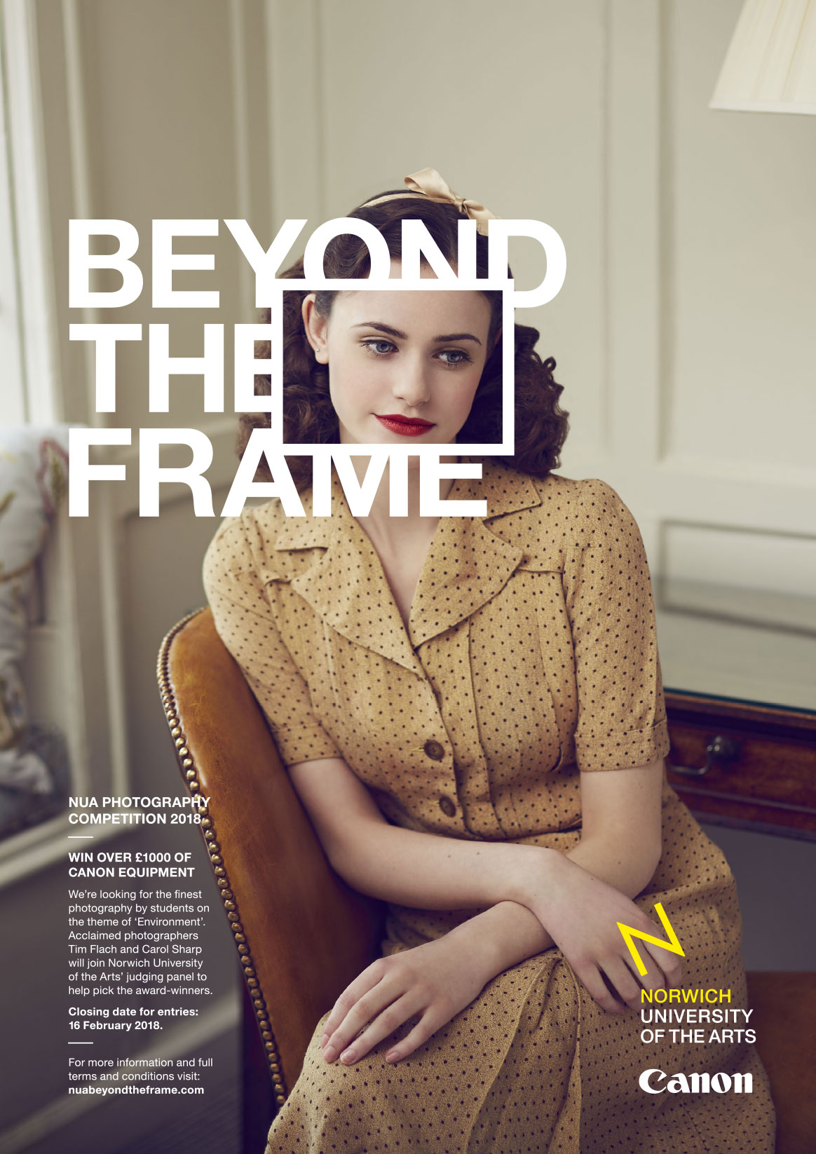
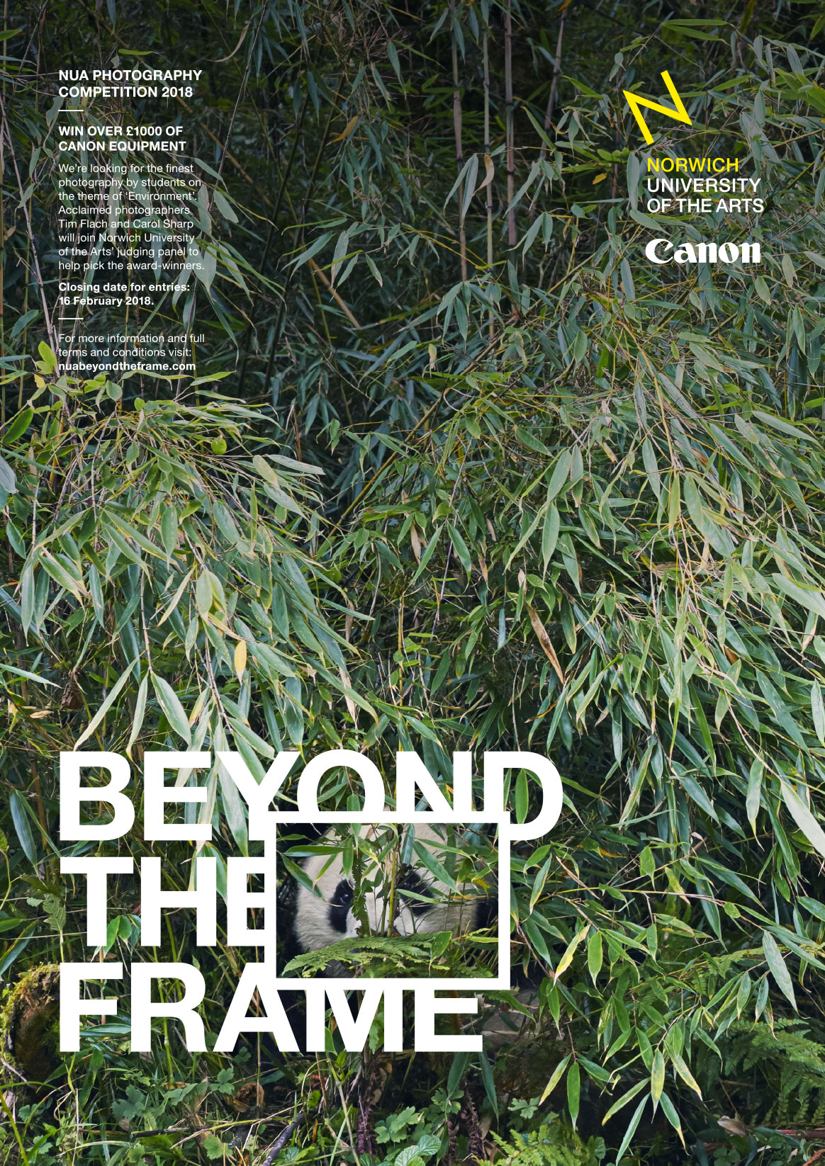
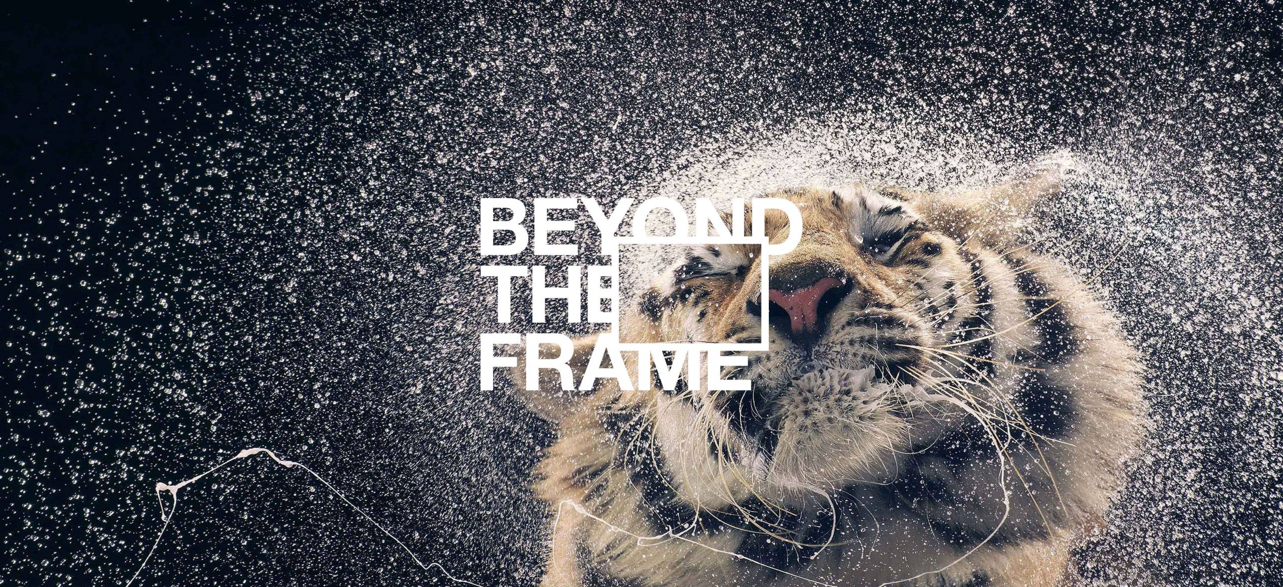
The foundation of this project is great photography; images that attract the eye and fire-up the imagination.
With this at the forefront, we created a flexible wordmark based around a ‘frame’ – a simple rectangle that disrupts, framing faces or other details. This creates an illusion of magnification, demanding attention, and its versatility allows it to seamlessly adapt to any image across any channel.
Using the wordmark, we then created a series of posters, leaflets, and digital adverts, as well as designing the competition website.