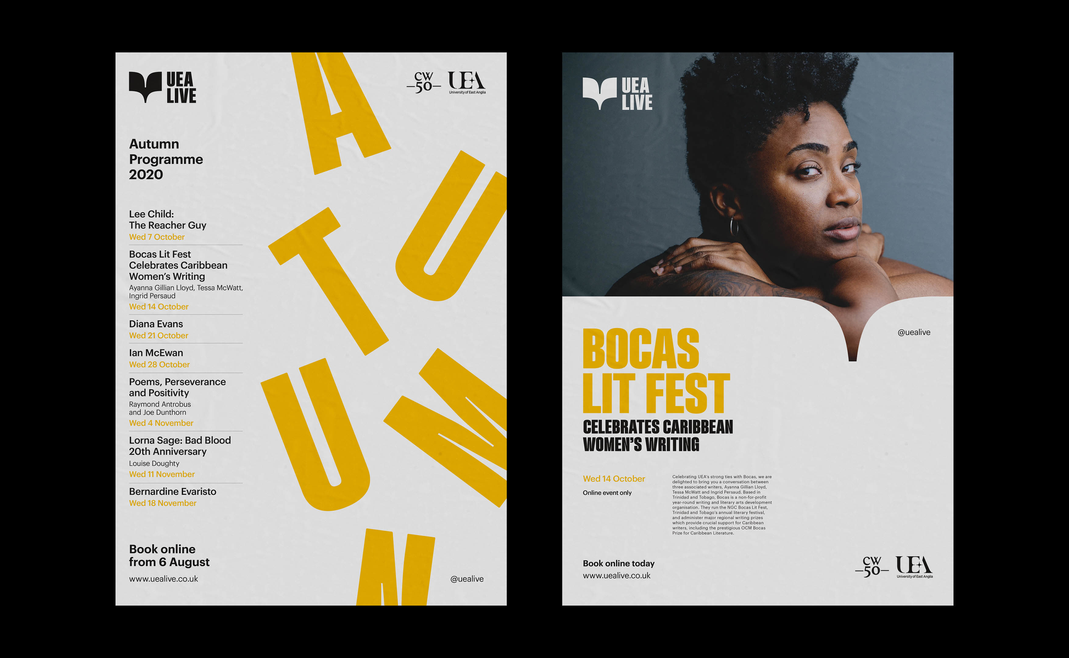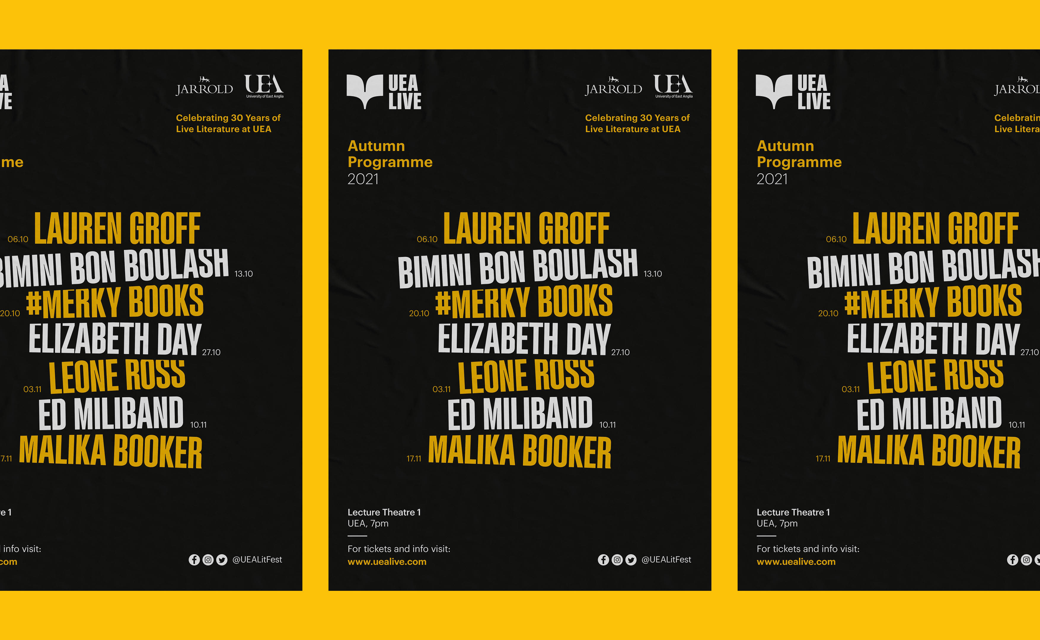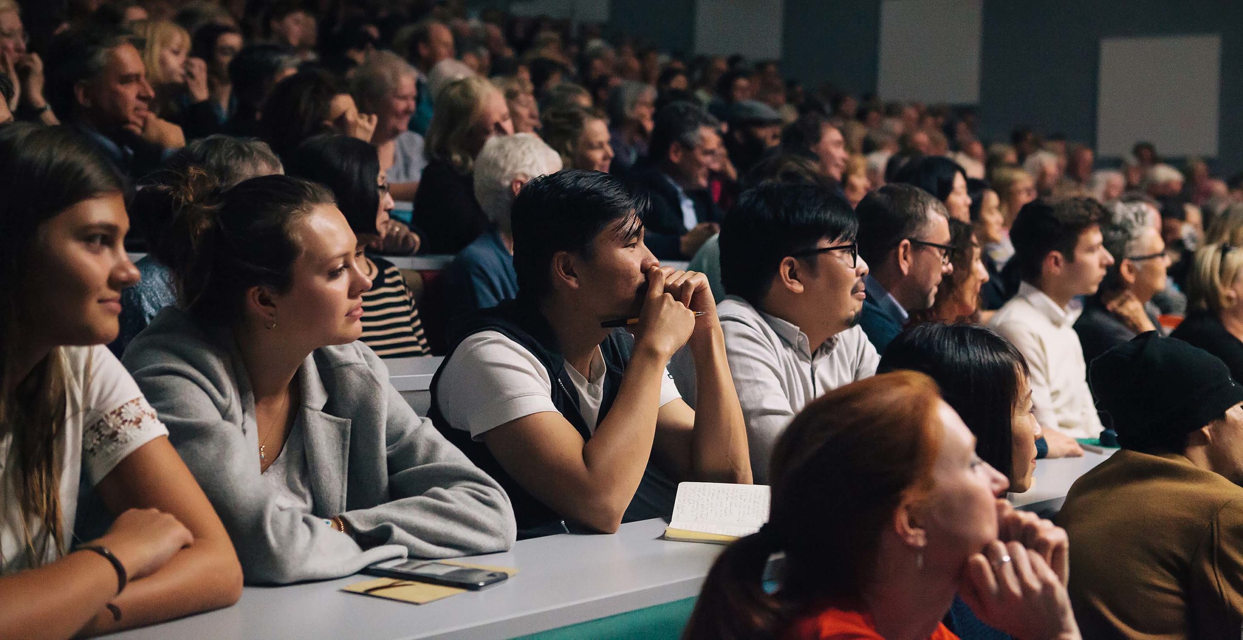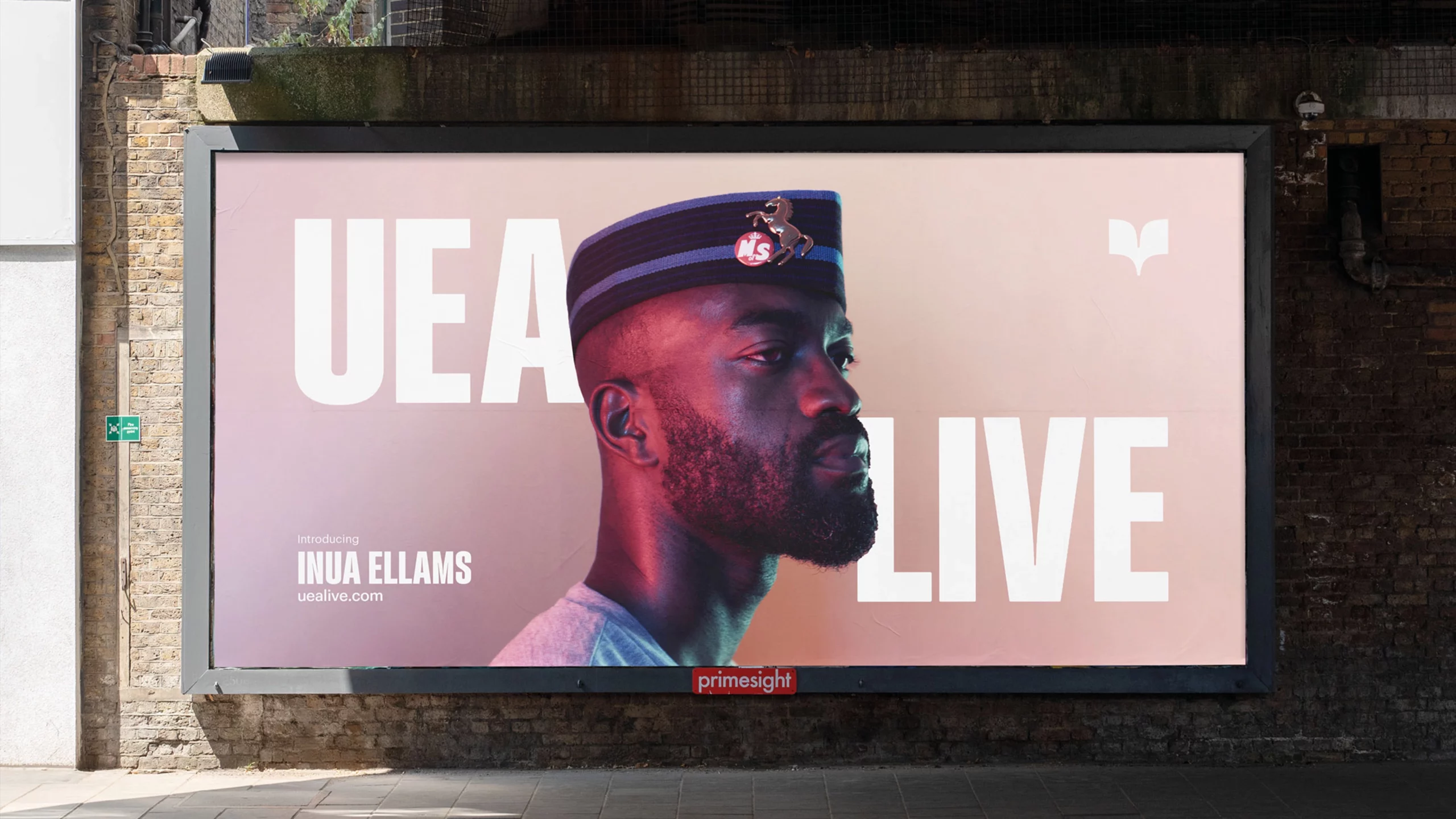
Since 1991, the UEA Live Literature Festival has been attracting world-class writers and thinkers to Norwich. It’s here that formidable talents – such as Zadie Smith, Kazuo Ishiguro and Emma Healey, to name a few – have given lively interviews about their life and work to over six thousand book-lovers each year.
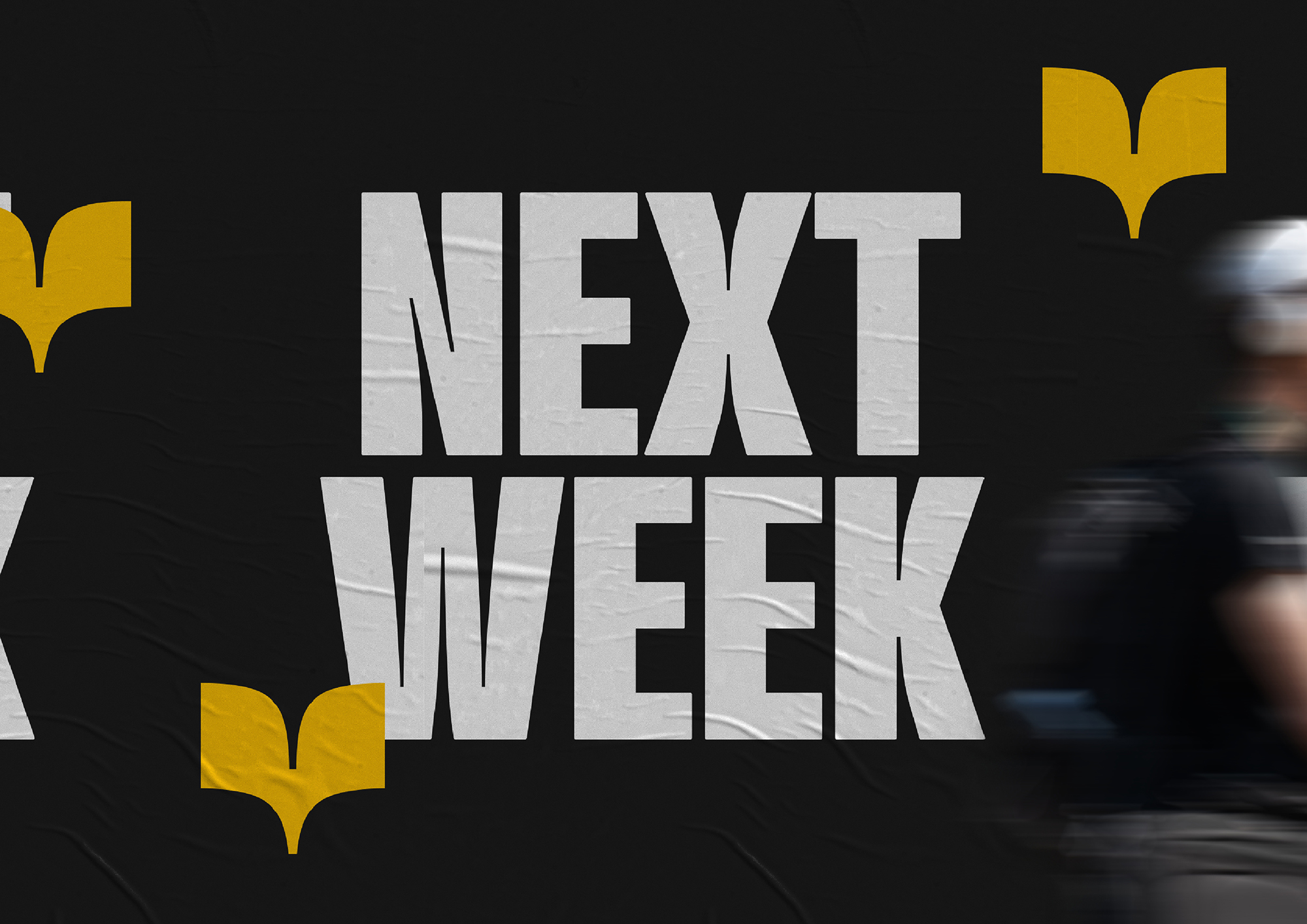
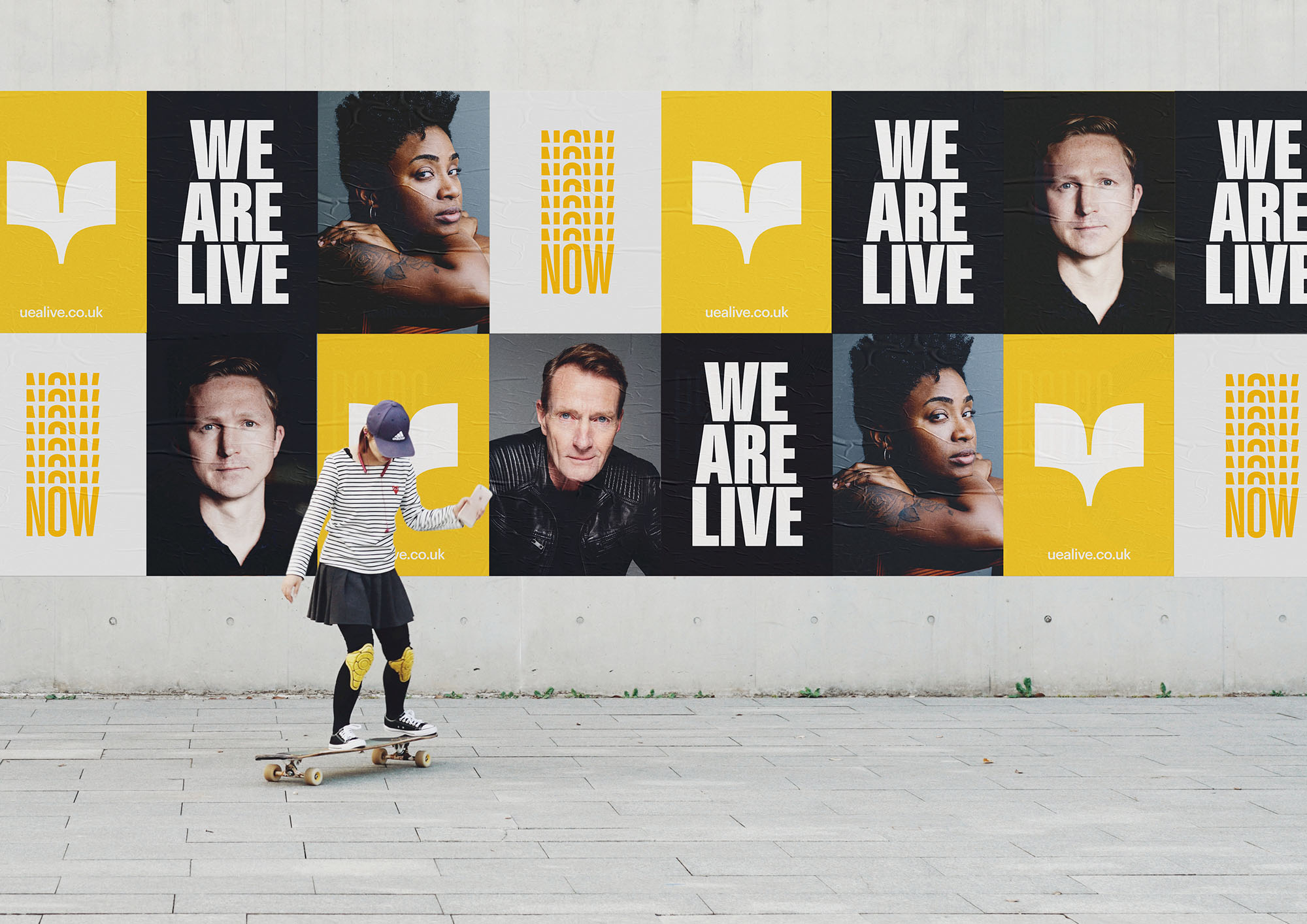
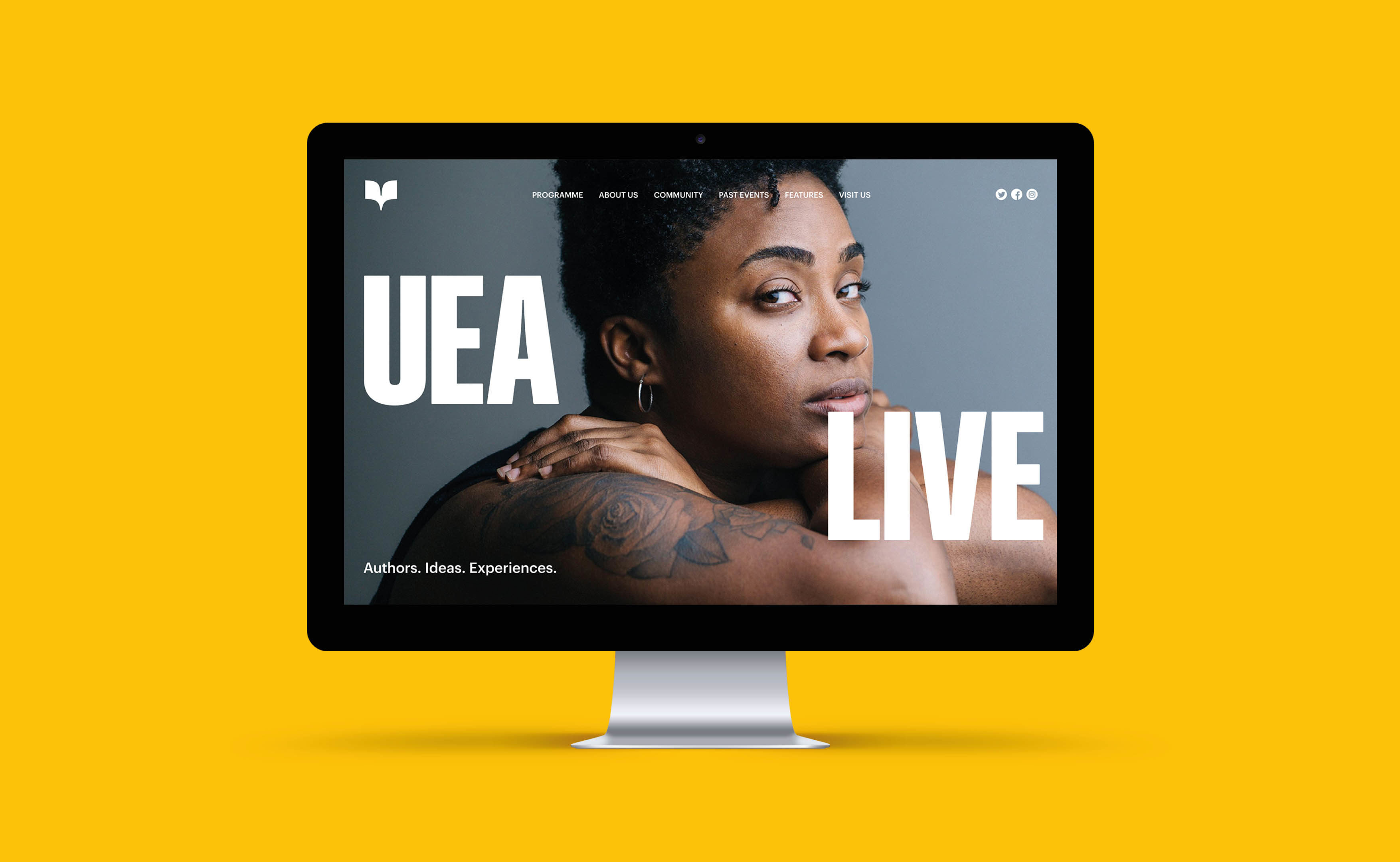
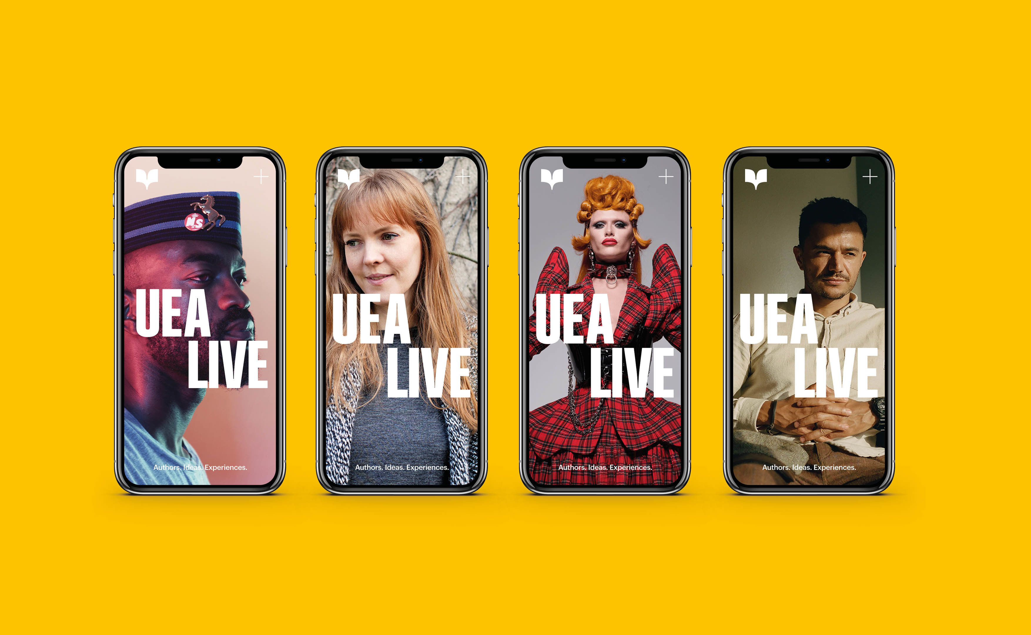
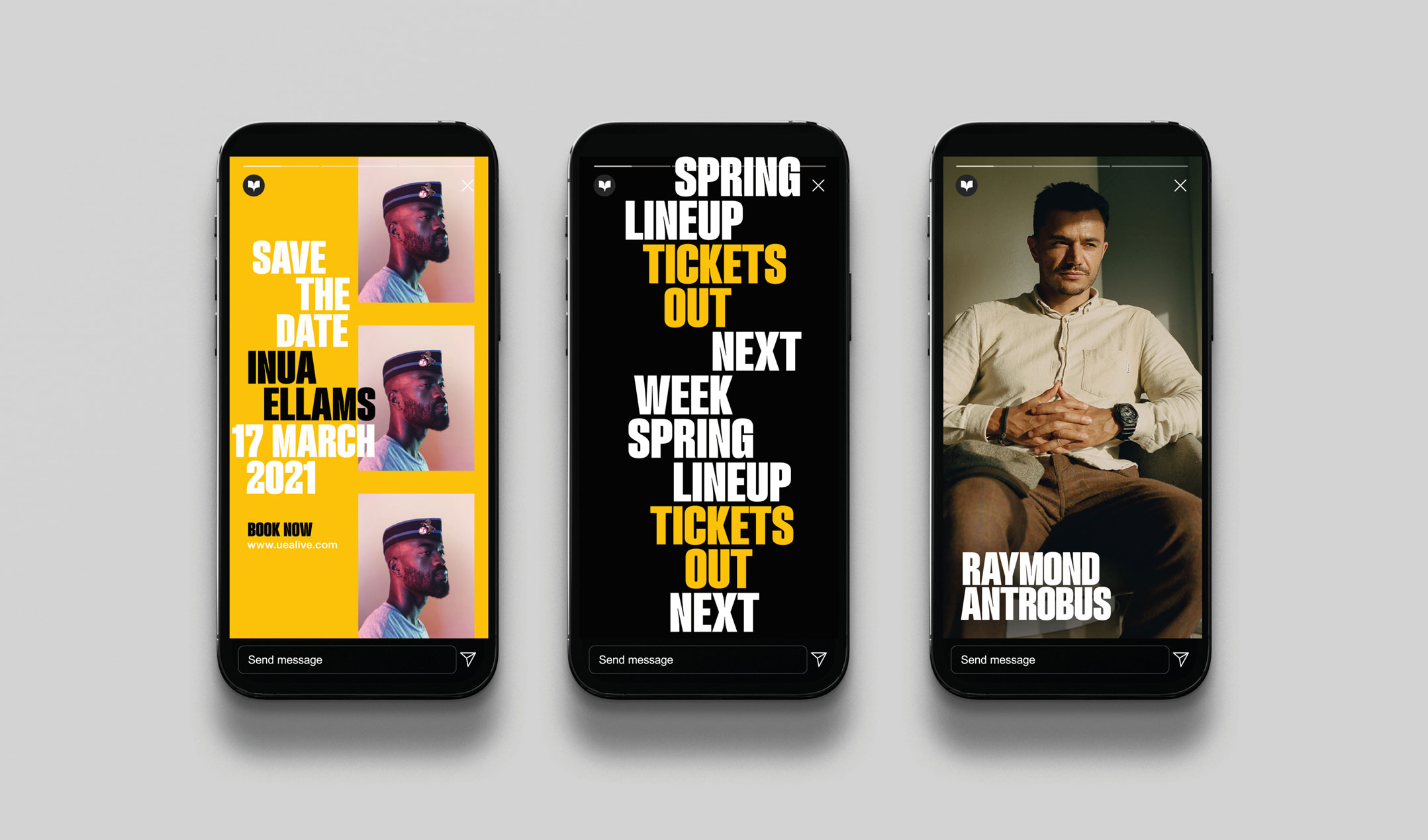
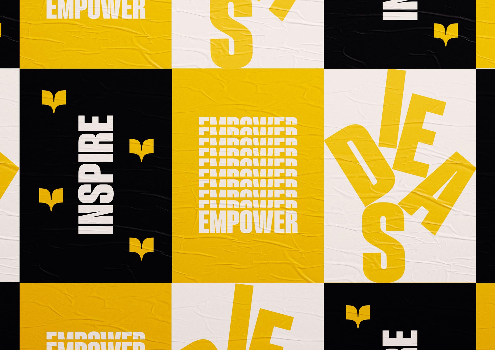
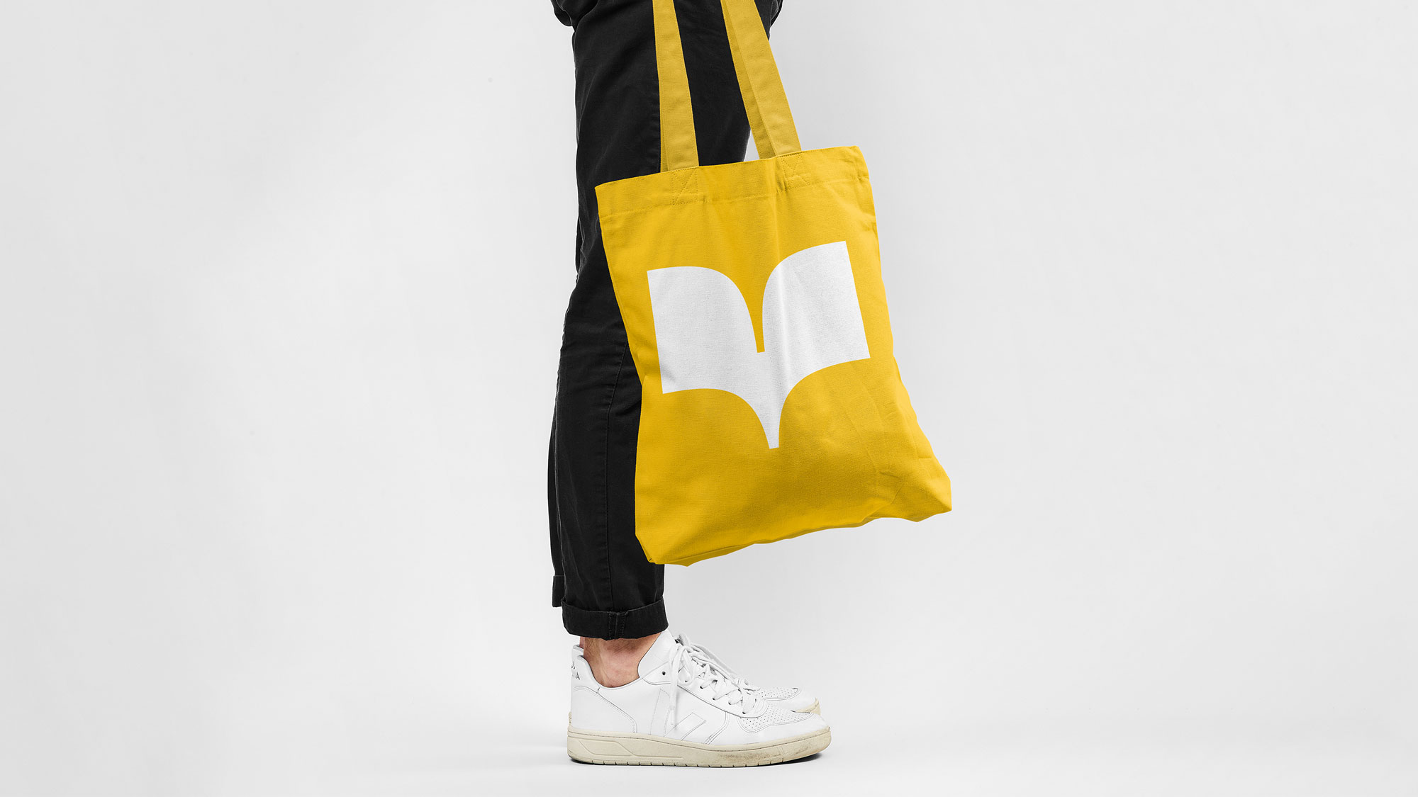
The logo is created using the curves of UEA’s signature ‘glint’ to form the shape of an open book, giving a firm nod to the festival’s history and setting, along with its literature.
It’s used playfully and dynamically across the brand, bringing assets to life, and is ever-present in communications.
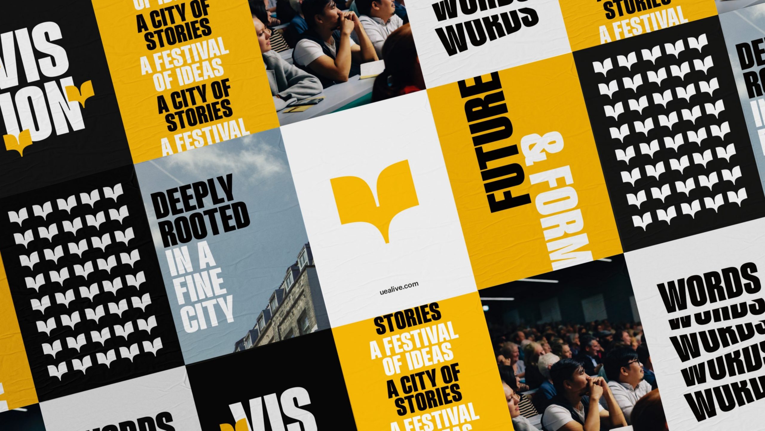
Together with a fresh, modern colour palette, and heavyweight type that calls to mind the university’s famous Brutalist architecture, well-placed typographic animations bring the written word to life across all digital channels.
We oversaw the rollout of all launch assets, including brand guidelines, print collateral, motion graphics and website design.